ブログのヘッダーをSVGとCSSでモーフィングする方法

はじめに
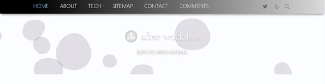
ブログをヘッダーのデザインを久しぶりに見直してみました。
今回取り入れたのは、ベーシックなSVGモーフィングをCSSのアニメーションで動かしてみました。
なぜSVGモーフィングを使うのか
理由はシンプルで単に目を引きたいからです。😅
ヘッダーに動きがあると何となくカッコよく見えるので、イケてるサイトだと勘違いしてくれることを期待しているからです。
しかし、JavaScriptで動かすとページスピードに影響が出るので、あまり凝ったモーフィングは避けました。
実は、変更前のヘッダーも簡単な流体シェイプを実装してました。
使用したのはBGJarのサイトで公開されいるAnimated Shapeです。
もっと派手な動きがあるものを探していたら、いつも参考にさせて頂いているKachibitoさんが波のモーフィングを公開されてました。

SVGモーフィング
Kachibitoさんのモーフィングはシンプルで美しいと感じたので、さっそくブログのヘッダーに実装して見ました。
ダークモード対応でfillの使い方を変更してますが、Webサイトに美しい波を出現させることが出来ました。
Kachibitoさん、ありがとうございます。
ブログに実装したコードを公開するので、興味がある方は参考にご覧下さい。
HTMLのコード
<!-- </header>の直下に置く -->
<div class='inner-header'>
<div class='header-top'>
<!-- ブログのロゴをヘッダーにSVGで表示する -->
<a class='d-block navbar-brand me-0' expr:href='data:blog.homepageUrl' expr:title='data:blog.title'><svg class='svg-logo' expr:aria-label='data:blog.title'>
<use href='#i-logo' /></svg></a>
<h4>Let's be more curious.</h4>
</div>
<!-- Waves Container -->
<div>
<svg class='waves' preserveAspectRatio='none' shape-rendering='auto' viewBox='0 24 150 28' xmlns='http://www.w3.org/2000/svg' xmlns:xlink='http://www.w3.org/1999/xlink'>
<defs>
<path d='M-160 44c30 0 58-18 88-18s 58 18 88 18 58-18 88-18 58 18 88 18 v44h-352z' id='gentle-waves' />
</defs>
<g class='parallax'>
<use class='wave-1' x='48' xlink:href='#gentle-waves' y='0' />
<use class='wave-2' x='48' xlink:href='#gentle-waves' y='2.3' />
<use class='wave-3' x='48' xlink:href='#gentle-waves' y='4.7' />
<use class='wave-4' x='48' xlink:href='#gentle-waves' y='7' />
</g>
</svg>
<!--Waves end-->
</div>
</div>CSSのコード
/* wave css */

.inner-header {
    position: relative;
    height: 26vh;
    background: var(--bs-weve-bgcolor);
    width: 100%;
    margin: 0;
    padding: 0;
}

.header-top {
    position: relative;
    height: 20vh;
}

.header-top a {
    position: relative;
    left: 50%;
    top: 25%;
    z-index: 9000;
    transform: translate(-50%, 0);
    max-width: calc(200px + 5vw);
    animation-name: fadeIn2;
    animation-duration: 1.2s;
}

.svg-logo {
    height: 40px;
}

.header-top h4 {
    position: relative;
    left: 50%;
    top: 32%;
    z-index: 9000;
    transform: translate(-50%, 0%);
    font-size: 100%;
    color: var(--jt-logo-color);
    max-width: calc(220px + 5vw);
    font-weight: normal;
    text-align: center;
    text-shadow: 0px 0px 5px rgb(0 0 0 / 50%), 0px 0px 10px rgb(0 0 0 / 20%);
    animation-name: fadeIn2;
    animation-duration: 1.2s;
}

.waves {
    position: relative;
    width: 100%;
    height: 6.1vh;
}

.wave-1 {
    fill: rgba(var(--bs-weve-bg), 0.2);
}

.wave-2 {
    fill: rgba(var(--bs-weve-bg), 0.5);
}

.wave-3 {
    fill: rgba(var(--bs-weve-bg), 0.7);
}

.wave-4 {
    fill: rgba(var(--bs-weve-bg), 1);
}

.parallax>use {
    animation: move-forever 25s cubic-bezier(.55, .5, .45, .5) infinite;
}

.parallax>use:nth-child(1) {
    animation-delay: -5s;
    animation-duration: 13.5s;
}

.parallax>use:nth-child(2) {
    animation-delay: -4s;
    animation-duration: 11s;
}

.parallax>use:nth-child(3) {
    animation-delay: -3s;
    animation-duration: 8.5s;
}

.parallax>use:nth-child(4) {
    animation-delay: -2s;
    animation-duration: 6s;
}

@keyframes move-forever {
    0% {
        transform: translate3d(-90px, 0, 0);
    }

    100% {
        transform: translate3d(85px, 0, 0);
    }
}

@keyframes fadeIn2 {
    0% {
        opacity: 0;
    }

    100% {
        opacity: 1;
    }
}

:root {
    --bs-weve-bg: 251, 253, 255;
    --bs-weve-bgcolor: linear-gradient(0deg, #005ed2, #0062d5, #006ddd, #007ce7, #008ef1, #00a1f8, #00b4fd, #00c6ff, #00d6ff, #00e2ff, #00eaff, #00edff);
    --jt-border-color: #adadad;
    --jt-logo-color: #f6f6f6;
    --jt-icon-color: #333333;
}

.dark-mode {
    --bs-weve-bg: 31, 31, 31;
    --bs-weve-bgcolor: linear-gradient(180deg, #030036, #02003b, #000248, #000c5b, #001d72, #00378d, #0059a8, #0082c3, #00acda, #00d3ed, #00eefa, #00f9ff);
    --jt-border-color: #b80000;
    --jt-logo-color: #c6ccd2;
    --jt-icon-color: #c6ccd2;
}
まとめ
SVGとCSSのアニメーションで美しい波のモーフィングを出すことが出来ました。コードも短いのでCPUの負荷も少なく、ページスピードへの影響もありませんでした。
今回背景画像はシンプルにグラデーションを設定しましたが、写真を表示すると、また変わった演出効果が出ると思います。
皆さんもヘッダーのデザインを変更し、自分好みのブログを変えてみては如何でしょうか。
気軽に足跡やコメントを残してね!
この記事が「気になった・参考になった」と感じた方は、リアクションボタンを押したり、コメントを残して頂けると嬉しいです。


